Showing posts with label discussion. Show all posts

Sunday, February 3, 2013

CRITIQUE 12 - TWO ABSTRACTS part 1 and 2


QUESTION from Jan Stickland:  Please give me your honest opinion of them and if i could improve on them somehow

ANSWER:  
Hi Jan - thank you so much for submitting for a critique!  Your abstracts are vibrant and full of color!  Very lovely!!

I don't need to talk color as you have a vast knowledge of it already!!
But I will talk about using value to set up a composition in a painting like this where you cannot lean on the structure of shapes to create the composition.

When an image has a lot of the same or similar value it may not have a strong focal point or direction for the eye to follow or be held in the piece.  

If you notice in the first image, it is much the same value overall, however, there is a hint of the eye heading toward the vortex...  so - If I enhanced that though hopefully we will see a stronger composition with interest to make the eye travel within the piece and also an area to slightly hold the eye's interest.
ORIGINAL PAINTING:

EDITED IMAGE:
Note the stronger lighted areas and how they grab your eye and lead you around the painting in a swirl motion to the center dark area just below the highlighted school of fish.


 There are several patterns that artists utilize in paintings whether they are abstract or representational.  one is the z pattern another is the triangle and so on.  These patterns make the eye follow through the piece to "read" it and create visual interest and visual sense.

For people who read left to right the eye naturally looks for patterns that match that idea.  Same with right to left readers, etc.

A strong pattern in this piece (to me) is a triangle

This is not the only answer, of course...  but it might give you a jump start!  
Best of luck with your work - it is wonderful!!
cj
PART 2:
QUESTION from Jan Stickland:  Please give me your honest opinion of them and if i could improve on them somehow
ANSWER:  PART 2 
Hi Jan - thank you so much for submitting for a critique!  Your abstracts are vibrant and full of color!  Very lovely!!  And I apologize for the photoshop mutilation of your artwork!  ;)

Again, great use of color and great excitement and movement in your 
ORIGINAL WORK:

Of course - for every "rule" there is the exception!  
I spoke a bit about patterns with your last abstract piece in part 1.

We read from left to right and tend to read paintings in the same manner.  If we don't  find landmarks where we expect them, then we are confused and do not know that to look at.

So, as in this piece, we give em landmarks via shape size and by changing value and contrasting areas in this
CRITIQUE:

So you see ... we have set the pattern the eye will follow with the falling orbs into a dark center with a glowing atmosphere that leads to the focal point of the highest contrasting values which is the left edge of the "hole"    
So you can set up tried and true patterns in your paintings - OR, you can set your own path for the eye to follow through your piece.
I hope that helps some - and remember - everything said is brought from that person's experiences in life - so you might find other solutions that work just as well from your experiences.  
There are many paths to the same goal! -cj
Best to you -
CJ

http://cdn.stumble-upon.com/images/32x32_su_shadow.gif

CRITIQUE 7 - FLORAL REVIEW


images below are copyright protected and are not for use other than in this post as a learning tool. These are only suggestions for variations on this piece.
 Question from Jan Stickland:
"Hey CJ! Want to know your opinion on how to make this painbetter! THANKYOU!" 
 CRITIQUE: To check a painting I recommend taking a photo of the artwork in grayscale or transforming it to grayscale in a photo program.

Now you can check the basic structure of the piece without the distraction of color.

Grayscale Check Points:

  1. Note if your focal point created by value (light and dark) is where you expect/desire it to be. 
  2. Is the direction of the lighting consistent?
  3. Do you have a variety of shapes, sizes and spacing for interest?
  4. is the background conflicting with elements of your composition
  5. Have items seemingly disappeared due to a lack of contrast?
  6. Edit the contrast in Photoshop until the desired effect is reached.

JAN'S ORIGINAL COLOR PAINTING:
  
JAN'S ORIGINAL COLOR PAINTING converted to grayscale:


CRITIQUE:
I recommend trying out different things in your photo editing software before editing your actual painting.
Start by editing a grayscale version of your piece. Then bring it back to color and adjust as needed.
After you have a clear idea of what you want to do - go ahead and edit the actual painting or create a new painting.

Edited grayscale image by CJ
Get in those lights and darks where you want them for drama in the picture!
  
A few additions:
  1. enhanced light source from the right side
  2. To add interest, create an erratic shaped bouquet instead of rounded
  3. add some dangly bits hanging off the side of vase to catch the eye and lead inward
      and to break the boundaries of the vase and outer edges of the main bouquet.
  4. you could even add some flowers that may have dropped to the table top.
  5. Add few larger flowers to balance the small ones or add a cluster of
      flowers for a larger spot of concentration.
  6. Soften the red in the background so it is not a main/major player in the composition.
EDITED Color IMAGE by CJ

create an entry point (the dangling flowers and the light spot on the vase)..
  1. create a path for the eye to follow through the composition (do this with color and value)


Thank you for allowing me to critique your wonderful floral painting - It is vibrant and beautiful just the way it is! CJ

http://cdn.stumble-upon.com/images/32x32_su_shadow.gif

CRITIQUE 6 - PORTRAIT Tips


images below are copyright protected to Artist and are not for use other than in this post as a learning tool.

Alice, Very nice likeness and sketching! You have created a very nice portrait with feeling! Just a few small tweaks might add to it's persona. I will offer general tips and ideas and also give some ideas that are specific to this drawing, Hope it helps - and - Thank you for allowing me to critique your portrait! cj
CRITIQUE:
I began by changing the color photo to grayscale in photoshop. This way, it is easier to see what is color and what is actual value change.

TIP:  A good idea with any painting or sketch is when you think you are finished, turn both the painting and the resource photo upside down and then on its edge and see how it looks. By turning the image, you stop seeing it as a person you know, a mouth, a nose and start seeing it more abstractly as shapes and values. Turned, you are more likely to spot if something is a bit off kilter, etc.
You have the eyes quite well and they are captivating for the viewer - and quite recognizable as the person you are drawing - so you already have your viewer at the eyes! Some hair out of place, etc is not important. However other major facial features are the next concern after the eyes.
TIP: Measure an eye in the original photo - then use it as a base for marking off distance and spacing for all other facial features in that particular face IN THE PHOTO. THEN - measure the same eye in your drawing and make the same spacing measurements on the drawing. This will make sure you have features properly sized and spaced. IF your drawing is the same size as the image in your photo, then you can apply the photo measurements to the drawing too.
TIP: when you feel your portrait is complete, set it aside for a few days, covered. THEN without looking at it, (don't peek!) set it up in an area that you might come around a corner and see it- and walk away without looking! .... I know it sounds crazy, but trust me...   When you are surprised later by walking into the view of the piece, it will be like seeing it for the first time.

If anything is "off" you will see it in that first glimpse and as you walk closer to the piece. Artists will do these things to get a fresh view or perspective on their own artwork. Even viewing it in a mirror or taking a photo and printing it out are good tools for a fresh view.
WORD OF WARNING about PHOTOS - "Photos lie!" Well.. ok, they don't always portray the actual truth of a subject. Where a photo might show a black area with no details might actually be not so black and full of details in person! So be aware that especially on a face - we do not have any detail-less black areas. - this comment is for artists trying to create a realistic looking portrait, not an abstraction, etc.
VALUE TIP: find the area on your portrait that is the darkest value and place it onto your drawing
Thank you for allowing me to critique your portrait - I hope these tips are helpful.
cj
.

DISCUSSION PART 2:
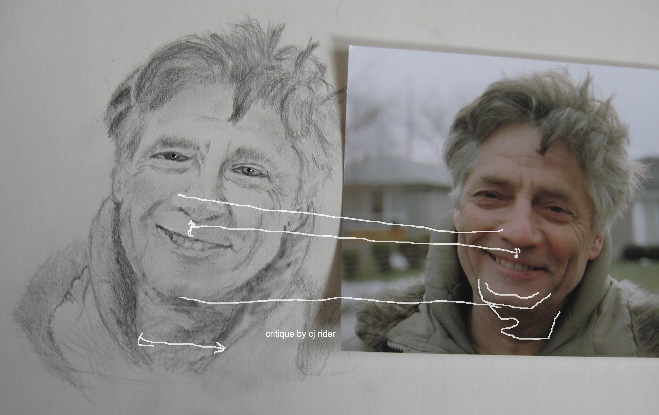
Edits as made by Alice- great improvement!


CRITIQUE on edited image by CJ:
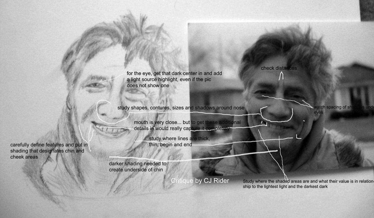
  1. Continue to check for spacing placement and sizing of features. Use the original tip above about measuring an eye or some other strong feature to use as a measure in photo then in drawing to insure size and placement is correct.
  2. Add more definition to chin with darker shading.
  3. Widen throat area- measure it with the eye in the drawing and then with the same eye in the photo- did you find the same or different amount of eyes fit across the throat?
  4. Add a dark center to the eye, then put in the light-source highlight. Your actual light source in this instance is not causing a highlight to the eyes that can be seen in this photo... In cases like this, I like to put one in anyway to add a sparkle to the eye. As you progress with your portraits you will learn to make the eyes look moist, etc. Make sure the light source is the same in each eye!
  5. note that center line of teeth usually is near the center of the bottom of the nose.
TIP: Line up the photo and the drawing evenly... lay a small ruler on the angle of the mouth, nose edges, (or whatever) in the photo, lay another small ruler on the drawing.. is the angle the same?

End critique-

Your hard work is really paying off! Congratulations! Great looking portrait!
cj

http://cdn.stumble-upon.com/images/32x32_su_shadow.gif

CRITIQUE 5 - De-clutter Photo


images below are copyright protected to Artist Karen Sliwinski and are not for use other than in this post as a learning tool.

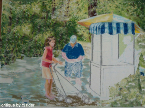
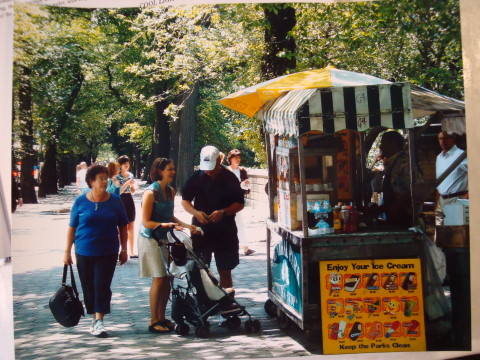
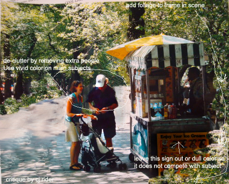
Karen stated that when turning her photo into a painting there were so many componants that it was difficult to discern the center of interest. She also asked about value variation.
  
ORIGINAL UNFINISHED PAINTING BY KAREN:
Looks GREAT! Love the way you are painting the figures as well as the foliage!


CRITIQUE:
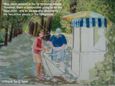
First task is to clear away some of the distractions and see what remains.


ABOVE: Removed extras and added foliage vingette on lower right edge - but note how the tree trunks come to an end right between the man and woman. Even though they are small, the woman's face is important. it is very detracting to have her facial profile lining up with the tree edge. Also, the base of the tree creates a line of sight across her neck, visually decapitating her.

Do not place strong value changes (or light against dark) in areas that are not your main focal point. The viewers eye will be distracted by high contrasting values, colors details and so on.

BELOW: remove distant point, and tree trunk between people - some subtle left edge tree trunks could probably be left in - I would also soften that tree behind the umbrella.

 If what you liked about the original photo was the tree-lined path, then all would have to again be reconsidered. ;)


Critique of Karen's original photo:

ORIGINAL PHOTO:

The photo is very busy with objects and contains many paths leading the eye in several directions through their value or vibrant color.
EXAMPLES:
  1. One point perspective tree'd path (in high contrast) leading to far back area of image
  2. Another light path between paying man and booth leading to rear area of image.
  3. Many subjects and many vivid colors all demanding equal attention.
Photo CRITIQUE:


Karen, Thank you for allowing me to critique your photo and artwork in progress! Your painting skills are fab!
cj

http://cdn.stumble-upon.com/images/32x32_su_shadow.gif

CRITIQUE 4 - Cassie Dog


images below are copyright protected to Artist Jan Stickland and are not for use other than in this post as a learning tool.

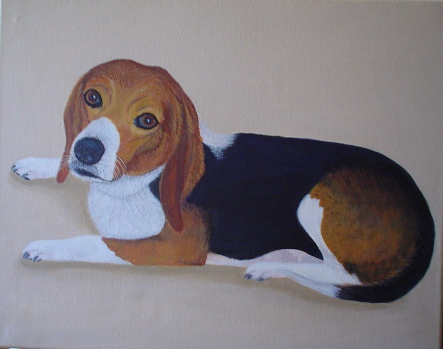
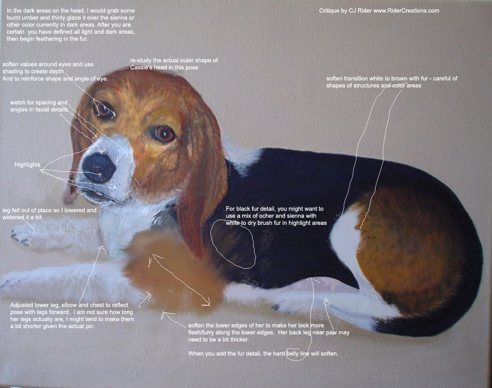
Besides a general critique, Jan inquired about what texture and colors can be added to the black fur. The colors used in the light fur are yellow ochre, burnt sienna and white.  
ORIGINAL PAINTING by Jan Stickland:
Actually, a very lovely painting as is!  Such a cute pooch!  This is Cassie!

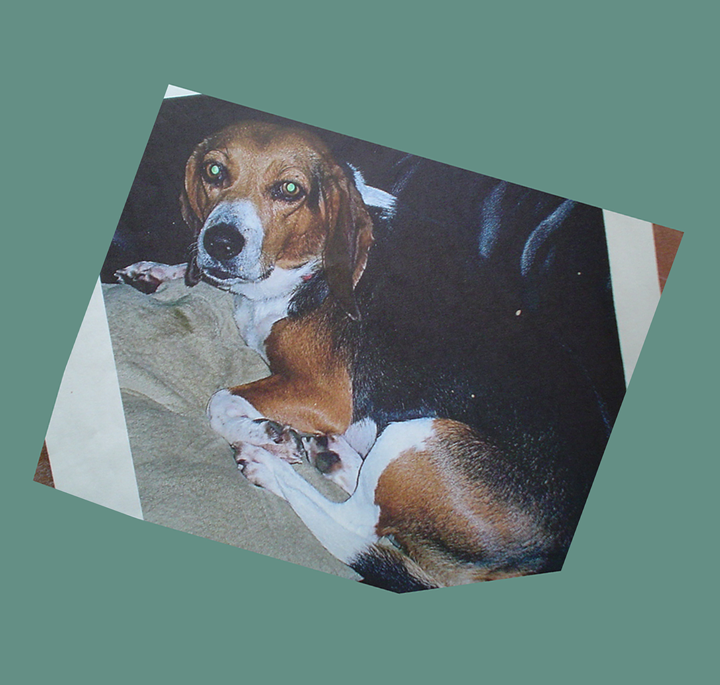
ORIGINAL PHOTO


CRITIQUE:
Details - In any painting, the first thing I consider is the placement of components in relationship to the overall object and in relationship to each other.  Keep re-checking as you paint to make sure shapes and angles remain as you intend.  


A dogs face can be very difficult due to foreshortening of the muzzle, shading, unfamiliar angles, etc..

Another issue is to make the dog look aged. hard sharp lines make the face appear younger, soft sagging lines give the appearance of age. Also a few gray hairs around the muzzle.
 

I often say "if you get the eyes right, much else will be forgiven" So if the eyes are on target, the viewer will not care if you miss a speckle or spot here and there! lol Jan did a marvelous job on the eyes - so alive and right to Cassie's character!
 

After the eyes, I would pay close attention to the shape of the black part of the nose, the muzzle and the shape of the white spot draping across the muzzle. The dogs lips also offer much insight and are an added bonus to further understanding Cassie's character.
 

I determined that the upper paw in the original painting detracted from the facial portrait so I moved down a bit, to be less of a focal issue. The lower edge of the dog's legs and body would appear more natural if softened and with more shading. Added detailing and shading on the cushion would add to the illusion she is set down into the surface.
 

For fur, I would first lay in the light and dark areas with whatever color you are using or burnt umber with a dark blue, maybe a squeak of black. As long as you establish the lights and darks that create the curves of the body. You can glaze these over the existing dark color so they blend nicely into each other along the edges and do not make spots. It may take several glazing layers to reach desired results. Then, you can dry brush in fur on top in a slightly darker or lighter value. I might experiment with some mauves and blues in the white and also the ochre and dark areas - just to break up the very yellow, ochre and dark dark darks... lol
 

A black or white object has much reflected color in it - so for instance, in the white chest, could have some blues, pinks violets etc all the while, the overall look is "white"

Thank you so much for allowing me to critique your painting -
Best Regards, CJ Rider

http://cdn.stumble-upon.com/images/32x32_su_shadow.gif

CRITIQUE 3 = Ocean and Beach


images below are copyright protected to Artist Ann Cam and are not for use other than in this post as a learning tool.

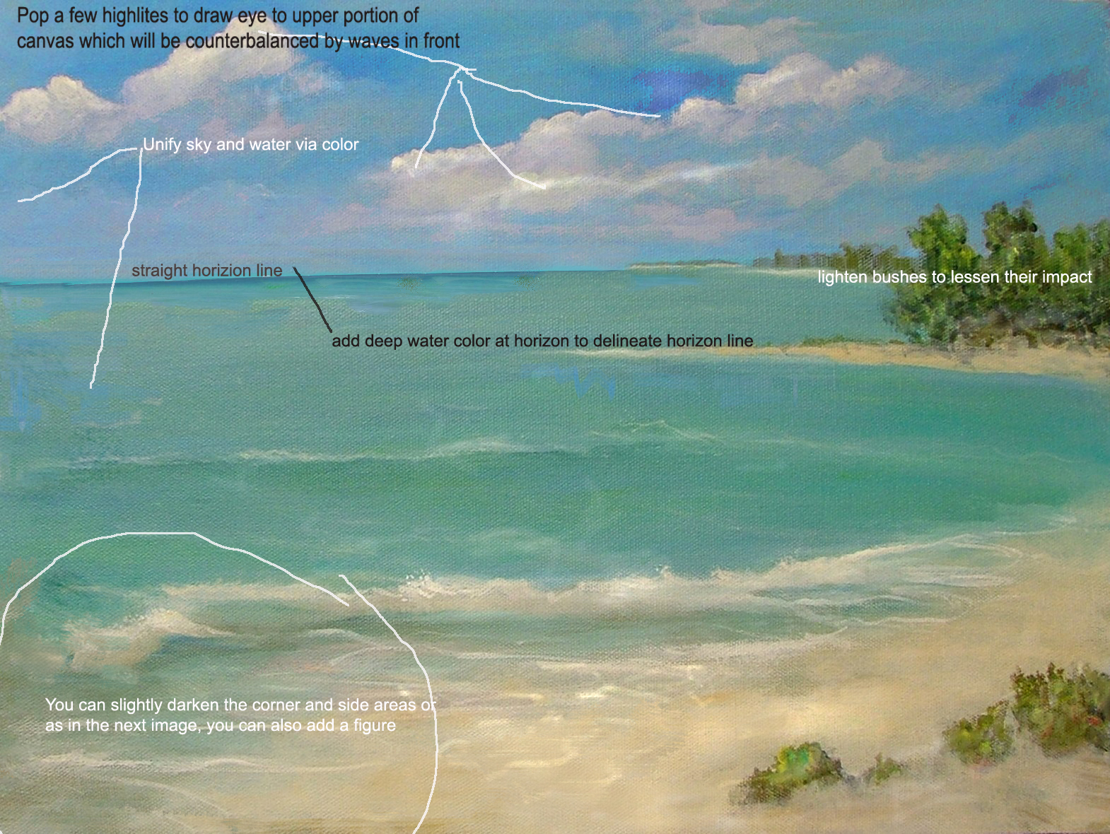
The main question artist Ann Cam asked is "When can you look at a painting and say it is done?"  While happy with the overall look of the painting, Ann wondered if it needed a few more elements, like a few birds, or a lone figure.

 ORIGINAL PAINTING by Ann Cam:
 
CRITIQUE:
As to the question when is a painting done... I always jokingly say "A painting is "done" in the last 10 to 15 minutes... ;)

But seriously, when you run your compositional, color, value, etc, checklists and are satisfied ... it could be done... for now anyway. 

However, as you progress as an artist you will look back at past artworks and see things you can add to sparkle it up.  So months or years later you might see how lopsided something is, or too centered, incorrect values, not detailed enough, and so on.

So, when is a painting finished?  In the last 10 or 15 minutes of painting!  Whenever that may be.    ;)


We learn from our experiences, so as we practice our skills "done" will hold a different meaning today than it did a month, or even a few days ago.


Ann's painting just needs a few touches to make it feel more finished as noted in the images below. 

To keep the eye on the canvas- slightly vignette the edges by softening forms/lines and in this case, toning down the value/lightness of said element.

For instance: see how the wave and lines (lower left) soften and are not so bright as the reach the edge of the canvas.  This will stop the eye from being lead off the canvas.  Same goes with the horizon line, I would soften and lighten it as it reached the left edge of the canvas instead of running it to the edge.

Below is an example with figure to add a human element to the painting.


Thank you for allowing me to critique your artwork.
It has been a pleasure.
CJ


http://cdn.stumble-upon.com/images/32x32_su_shadow.gif