Showing posts with label composition. Show all posts

Sunday, February 3, 2013

CRITIQUE 13 geoff in oil part 2


Wow Pandora, you have been busy!!

Yes, the blue background is fine.
I see you did many updates! You are doing a great job!
The T-shirt is a nice add in!

Your flesh tones are very nice, but be careful of the dark areas that they do not become too gray-blue.

The cheek shapes are looking good and I know it took a lot of study and work to accomplish this level of detail.

Note how detail at jaw-line and chin make face appear longer and less round.


EDITS BY PANDORA:

http://cdn.stumble-upon.com/images/32x32_su_shadow.gif

CRITIQUE 13 - geoff in oil


CRITIQUE:


Coming along nicely!  
I recommend placing some preliminary lines in your drawing before painting to make sure you have your angles and features in the right position. you will continue to check these angles as you paint. See photograph as well as line across the eyes on painting. 
The left side of the face (as we are looking at the image) is good and you also have a nice cheek color there but note how that eye and eyebrow are a tad large and low.  I have made it more obvious by drawing a line across the painting and on the photo.

TIP:
tape the photo directly on your canvas - have it lined up with the painting edges maybe put it tight in a corner of the canvas so you have 2 edges lined up- now put a ruler across the eyes in the photo and that same angle should be reflected in the eyes in your painting.
 
Reflect back to the instructions for the drawing critique- note the angle of the jawline and define the shape of the chin. 
Note that the neck needs to be a tad wider on right side (as we look at the painting). 
You are doing great! just keep refining the features and watch it evolve!!  
This is a beautiful painting Pandora - it evokes much feeling in the viewer!
cj

EDITs BY ALICE:


CRITIQUE TO BE CONTINUED....
>>HERE<<


http://cdn.stumble-upon.com/images/32x32_su_shadow.gif

CRITIQUE 12 - TWO ABSTRACTS part 1 and 2


QUESTION from Jan Stickland:  Please give me your honest opinion of them and if i could improve on them somehow

ANSWER:  
Hi Jan - thank you so much for submitting for a critique!  Your abstracts are vibrant and full of color!  Very lovely!!

I don't need to talk color as you have a vast knowledge of it already!!
But I will talk about using value to set up a composition in a painting like this where you cannot lean on the structure of shapes to create the composition.

When an image has a lot of the same or similar value it may not have a strong focal point or direction for the eye to follow or be held in the piece.  

If you notice in the first image, it is much the same value overall, however, there is a hint of the eye heading toward the vortex...  so - If I enhanced that though hopefully we will see a stronger composition with interest to make the eye travel within the piece and also an area to slightly hold the eye's interest.
ORIGINAL PAINTING:

EDITED IMAGE:
Note the stronger lighted areas and how they grab your eye and lead you around the painting in a swirl motion to the center dark area just below the highlighted school of fish.


 There are several patterns that artists utilize in paintings whether they are abstract or representational.  one is the z pattern another is the triangle and so on.  These patterns make the eye follow through the piece to "read" it and create visual interest and visual sense.

For people who read left to right the eye naturally looks for patterns that match that idea.  Same with right to left readers, etc.

A strong pattern in this piece (to me) is a triangle

This is not the only answer, of course...  but it might give you a jump start!  
Best of luck with your work - it is wonderful!!
cj
PART 2:
QUESTION from Jan Stickland:  Please give me your honest opinion of them and if i could improve on them somehow
ANSWER:  PART 2 
Hi Jan - thank you so much for submitting for a critique!  Your abstracts are vibrant and full of color!  Very lovely!!  And I apologize for the photoshop mutilation of your artwork!  ;)

Again, great use of color and great excitement and movement in your 
ORIGINAL WORK:

Of course - for every "rule" there is the exception!  
I spoke a bit about patterns with your last abstract piece in part 1.

We read from left to right and tend to read paintings in the same manner.  If we don't  find landmarks where we expect them, then we are confused and do not know that to look at.

So, as in this piece, we give em landmarks via shape size and by changing value and contrasting areas in this
CRITIQUE:

So you see ... we have set the pattern the eye will follow with the falling orbs into a dark center with a glowing atmosphere that leads to the focal point of the highest contrasting values which is the left edge of the "hole"    
So you can set up tried and true patterns in your paintings - OR, you can set your own path for the eye to follow through your piece.
I hope that helps some - and remember - everything said is brought from that person's experiences in life - so you might find other solutions that work just as well from your experiences.  
There are many paths to the same goal! -cj
Best to you -
CJ

http://cdn.stumble-upon.com/images/32x32_su_shadow.gif

CRITIQUE 10 - Values


QUESTION from Terry: Please have a look at this one for me CJ..  It's been on the back burner since 06 and really needs to escape from the studio.It's four feet square, Acrylic on an Oak Plywood panel..

ANSWER: AND CRITIQUE
Terry,   Cool painting! Time to finish it up!!  ;)
I would work with the values-

Enhance main character:  Highlights on the main character bring the eye more strongly to the focal point. Note how I have added several brightened areas to the main figure... You don't want to add too much, but just enough to make the eye see the whole figure and stay interested with maybe a glimpse or two to the outer edges.

I also enhanced the row of ladies as I feel they are of secondary importance. In turn, I enhanced some of the grass at the dancer's feet to lead the eye to and from the dancers.

To help the eye know what to look at, I dulled down the color on the sides to keep the eye from becoming overwhelmed with bright value and color. especially hot spots of color in the form of one bloom or several.

You can dull down the background areas with a thin glaze of grayed down color and of course you can enhance the figure with stronger/lighter and brighter color via glazes and direct painting.
 EDITED IMAGE:


ORIGINAL IMAGE:

http://cdn.stumble-upon.com/images/32x32_su_shadow.gif

CRITIQUE 2 - MOOving the Cows!


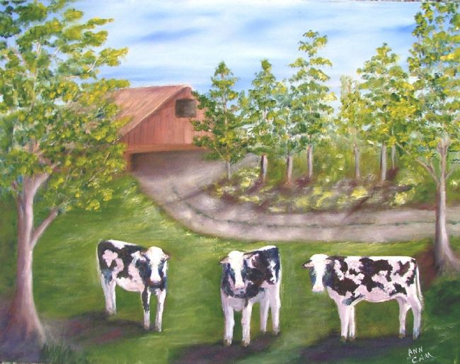
images below are copyright protected to Artist Ann Cam and are not for use other than in this post as a learning tool.

The main question artist Ann asked about this painting was concerning the placement of the cows. 
Secondly, Ann stated that she is not yet finished with the shadows.
 ORIGINAL PAINTING by Ann Cam:


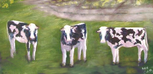
The cows and the curve of the driveway tend to divide the painting into a lower and upper section.
Although I know they do pose for the camera when you walk up to take their pic,
we do not want them to feel posed in our painting. So they need some adjustment to better fit their environment.


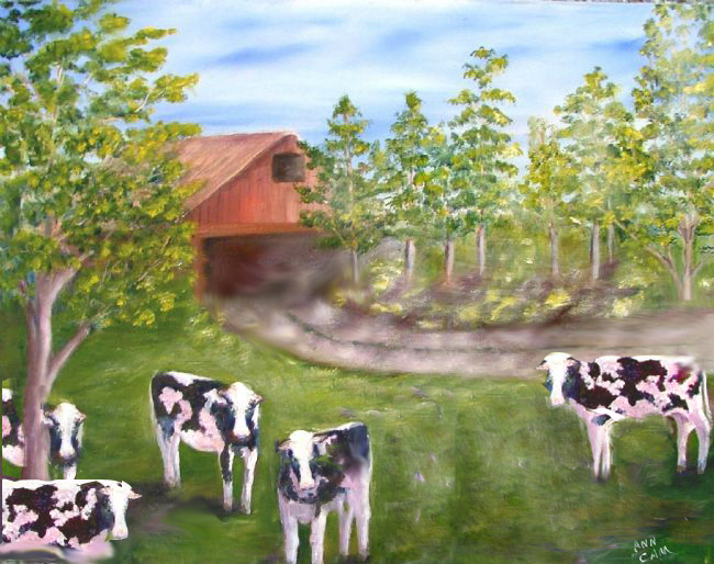
Critique solution to the placement of cows, their shadows,
barn, driveway, and tr
ee removal on right.
Image below:


 For interesting composition, create variation in size, spacing and orientation

 I moved 2 cows further to the left. The center cow's tail-end was "kissing" the driveway edge so I placed him lower in the scene. The cow on the left was raised to break through the centerline and was angled slightly so his broadside doesn't block the viewer's entry into the scene.  I would further paint that large grassy area, lighter toward center and top to further draw the eye into the painting.  Maybe put a flicking tail on the little center cow so his rear edge isn't so flat.


FURTHER THOUGHTS ON THIS PAINTING as FYI:

 This piece could be two paintings... one of cows 


and one of a barn scene which is why I brought the one cow up into the driveway as well as re-angled the driveway


 Here is another potential solution with the addition of cows: 

Ann, I hope this info gave you some ideas on where you might place your cows, etc.

Thank you for allowing me to Critique your artwork -
Best Regards, CJ


http://cdn.stumble-upon.com/images/32x32_su_shadow.gif