Showing posts with label placement. Show all posts

Saturday, February 23, 2013

CRITIQUE 15 -PROPORTIONS: EYES

There are many good things about your sketch! You have a created a good likeness to the original image and I will show you how to make a few tweaks to get it even closer.
I will break down your portrait sketch review into several parts so we can be more thorough. 
Below is part one.

I want to focus on placement of eyes in relation to each other and the space for the nose. I would recommend sketching just the eyes and bridge of nose (utilizing the tips) a few times until you begin to see more and more details. The more you draw something - the more you see its details.
You have the lower edge of the eyes in proper alignment with each other in your sketch, but if it ever becomes an issue, you can see how a line under the eyes on the original would help you clearly visualize how the eyes are placed on the face.


http://cdn.stumble-upon.com/images/32x32_su_shadow.gif

Sunday, February 3, 2013

CRITIQUE 2 - MOOving the Cows!


images below are copyright protected to Artist Ann Cam and are not for use other than in this post as a learning tool.

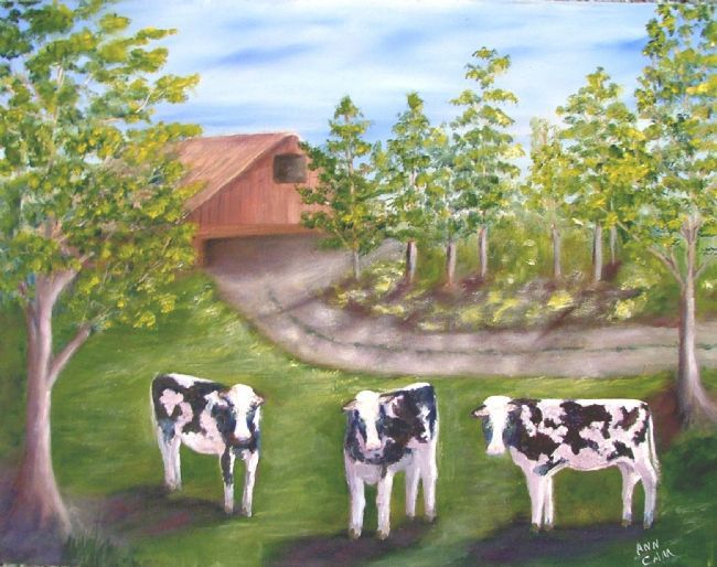
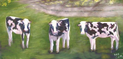
The main question artist Ann asked about this painting was concerning the placement of the cows. 
Secondly, Ann stated that she is not yet finished with the shadows.
 ORIGINAL PAINTING by Ann Cam:


The cows and the curve of the driveway tend to divide the painting into a lower and upper section.
Although I know they do pose for the camera when you walk up to take their pic,
we do not want them to feel posed in our painting. So they need some adjustment to better fit their environment.


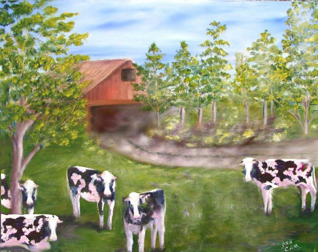
Critique solution to the placement of cows, their shadows,
barn, driveway, and tr
ee removal on right.
Image below:


 For interesting composition, create variation in size, spacing and orientation

 I moved 2 cows further to the left. The center cow's tail-end was "kissing" the driveway edge so I placed him lower in the scene. The cow on the left was raised to break through the centerline and was angled slightly so his broadside doesn't block the viewer's entry into the scene.  I would further paint that large grassy area, lighter toward center and top to further draw the eye into the painting.  Maybe put a flicking tail on the little center cow so his rear edge isn't so flat.


FURTHER THOUGHTS ON THIS PAINTING as FYI:

 This piece could be two paintings... one of cows 


and one of a barn scene which is why I brought the one cow up into the driveway as well as re-angled the driveway


 Here is another potential solution with the addition of cows: 

Ann, I hope this info gave you some ideas on where you might place your cows, etc.

Thank you for allowing me to Critique your artwork -
Best Regards, CJ


http://cdn.stumble-upon.com/images/32x32_su_shadow.gif