Showing posts with label portrait. Show all posts

Saturday, February 23, 2013

CRITIQUE 15 -PROPORTIONS: EYES

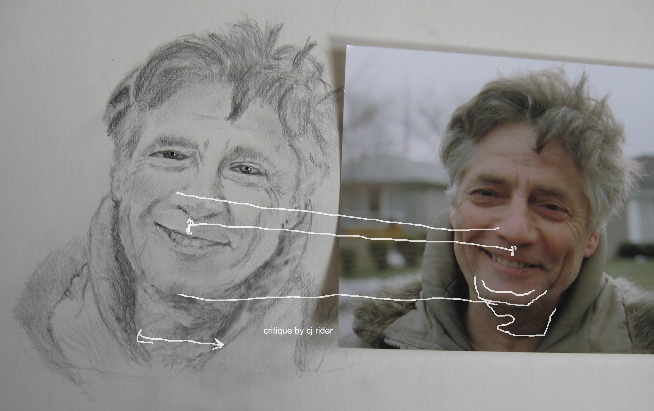
There are many good things about your sketch! You have a created a good likeness to the original image and I will show you how to make a few tweaks to get it even closer.
I will break down your portrait sketch review into several parts so we can be more thorough. 
Below is part one.

I want to focus on placement of eyes in relation to each other and the space for the nose. I would recommend sketching just the eyes and bridge of nose (utilizing the tips) a few times until you begin to see more and more details. The more you draw something - the more you see its details.
You have the lower edge of the eyes in proper alignment with each other in your sketch, but if it ever becomes an issue, you can see how a line under the eyes on the original would help you clearly visualize how the eyes are placed on the face.


http://cdn.stumble-upon.com/images/32x32_su_shadow.gif

Monday, February 18, 2013

MAGIC FLESH TONE FORMULA!


HOW TO MIX FLESH TONES
Mixing correct flesh tones is the Holy Grail of portrait painting! No wonder manufactures make tubes labeled "flesh"!!

The first thing to wrap your mind around is that a tube of paint labeled "flesh" - isn't!  
Don't be fooled into thinking you will buy a magic tube of flesh and begin painting accurate skin tones with it. (first of all, think logically - it is labeled "flesh" but WHOSE flesh? Yours? Anyone's you know? How about anyone's you have ever seen before??  Really look at the color and compare it to several types of real skin!
You may have done or have heard of others doing a great deal of work to find some artist's secret recipe to making fleshtones?    Hogwash!! While there are some common sense guidelines for specific skin types ... there is no one magic bullet formula for mixing "fleshtones."

Retrain your mind to think differently about "white" flesh, "brown or black" Flesh because there is no such flesh in real life!
While creating self-portraits with a group of children several of them candidly stated that they had white or black or brown flesh and reached for that color of pencil or paint.

My job was to teach them to see the actual colors in their flesh!
I held up a sheet of bright white typing paper which they all agreed was white. I passed out a sheet to each student and asked them to place their hand on the paper and now tell me what color their skin is. Surprisingly some still said the caucasian skin was "white" and any of color was black. I went on to demonstrate and explain the nature of flesh. They started seeing the actual colors instead of the labels.

*We are loaded with preconceptions about colors, shapes and objects at a very young age. When asked to describe something or draw it, we revert back to these preconceived notions learned very early in life. These are most likely very primitive perceptions of what something actually is.

Same holds true with color.
If asked "what color is the sky" many will just say "blue
."  But is it just blue? Can you grab a tube of blue paint and paint any sky? (first decision would be which blue! "Sky Blue"??)

HOW TO PAINT FLESH:
Flesh is just like any other object you paint - it is subject to its origin and to its surroundings.  

What I mean by that is its origin may be native american, caucasian, etc,  while its surroundings may be wood, metal, colored cloth, the atmosphere, type of lighting, ie reflective light, and so on.
 
Knowledgeable artists represent a pure white flower or cloth using a myriad of colors not just white and gray/black.  That is how flesh is.  It isn't pure white, pink, black, brown etc.   
There is no single formula for flesh!!
So you might wonder if you should own a tube of "flesh" paint?   From my personal and teaching experience I say not early on as it can be more confusing than helpful.  Some tube "fleshes" tend to go muddy/gray rather quickly when mixed with other colors, so if you already own a tube or plan to buy one anyway... it is important to understand what colors make up your tube of "flesh" if you plan to use it as a base for mixing other needed flesh tones.  

You will find some common ground but in general, every time you paint a portrait, you will recreate what color "flesh" is. The key is to be observant to the local colors, reflective color, shadows, surroundings, etc.
If you would like a critique or have a question- please drop me a message! 

©CJ Rider

http://cdn.stumble-upon.com/images/32x32_su_shadow.gif

Sunday, February 3, 2013

CRITIQUE 13 geoff in oil part 2


Wow Pandora, you have been busy!!

Yes, the blue background is fine.
I see you did many updates! You are doing a great job!
The T-shirt is a nice add in!

Your flesh tones are very nice, but be careful of the dark areas that they do not become too gray-blue.

The cheek shapes are looking good and I know it took a lot of study and work to accomplish this level of detail.

Note how detail at jaw-line and chin make face appear longer and less round.


EDITS BY PANDORA:

http://cdn.stumble-upon.com/images/32x32_su_shadow.gif

CRITIQUE 13 - geoff in oil


CRITIQUE:


Coming along nicely!  
I recommend placing some preliminary lines in your drawing before painting to make sure you have your angles and features in the right position. you will continue to check these angles as you paint. See photograph as well as line across the eyes on painting. 
The left side of the face (as we are looking at the image) is good and you also have a nice cheek color there but note how that eye and eyebrow are a tad large and low.  I have made it more obvious by drawing a line across the painting and on the photo.

TIP:
tape the photo directly on your canvas - have it lined up with the painting edges maybe put it tight in a corner of the canvas so you have 2 edges lined up- now put a ruler across the eyes in the photo and that same angle should be reflected in the eyes in your painting.
 
Reflect back to the instructions for the drawing critique- note the angle of the jawline and define the shape of the chin. 
Note that the neck needs to be a tad wider on right side (as we look at the painting). 
You are doing great! just keep refining the features and watch it evolve!!  
This is a beautiful painting Pandora - it evokes much feeling in the viewer!
cj

EDITs BY ALICE:


CRITIQUE TO BE CONTINUED....
>>HERE<<


http://cdn.stumble-upon.com/images/32x32_su_shadow.gif

CRITIQUE 8 -Portrait of Father


Alice, Very nice likeness and sketching!   I will offer tips and ideas to aid in spacing of the features.   Hope it helps - and - Thank you for allowing me to offer pointers concerning your portrait!

cj

PS - forgive the measure markings in the hair!!  lol

CRITIQUE:


TIP: A good idea with any painting or sketch is when you think you are finished, turn both the painting and the resource photo upside down and then on its edge and see how it looks. By turning the image, you start seeing it more abstractly as shapes and values. Turned, you are more likely to spot if something is a bit off kilter, etc.

TIP: Measure an eye in the original photo - then use that measurement as a base for marking off distance and spacing for all facial features in the photo.

THEN - measure the same eye (either right or left) in your drawing and make the same spacing measurements on the drawing.  For instance maybe the nose is a certain number of "eye's" long, and so on.  This will make sure you have features properly sized and spaced. IF your drawing is the same size as the image in your photo, then you can apply the photo measurements to the drawing too.

TIP: when you feel your portrait is complete, set it aside for a few days, covered. THEN without looking at it, (don't peek!) set it up in an area that you might come around a corner and see it- and walk away without looking! .... I know it sounds crazy, but trust me... When you are surprised later by walking into the view of the piece, it will be like seeing it for the first time. If anything is "off" you will see it in that first glimpse and as you walk closer to the piece. Artists will do these things to get a fresh view or perspective on their own artwork.

TIP: View image in a mirror for a fresh perspective

TIP: take a photo and look at it on the computer screen or print it for a fresh view.

WORD OF WARNING about  working from PHOTOS - "Photos lie!" Well.. ok, they don't always portray the actual truth of a subject. One instance is where a photo might show a black area with no details might actually be not so black and full of details in person! So be aware that especially on a face - we do not have any detail-less black areas.

VALUE TIP: find the area on your portrait that is the darkest value and place it onto your drawing

Thank you for allowing me to critique your portrait - I hope these tips are helpful.

cj

http://cdn.stumble-upon.com/images/32x32_su_shadow.gif

CRITIQUE 6 - PORTRAIT Tips


images below are copyright protected to Artist and are not for use other than in this post as a learning tool.

Alice, Very nice likeness and sketching! You have created a very nice portrait with feeling! Just a few small tweaks might add to it's persona. I will offer general tips and ideas and also give some ideas that are specific to this drawing, Hope it helps - and - Thank you for allowing me to critique your portrait! cj
CRITIQUE:
I began by changing the color photo to grayscale in photoshop. This way, it is easier to see what is color and what is actual value change.

TIP:  A good idea with any painting or sketch is when you think you are finished, turn both the painting and the resource photo upside down and then on its edge and see how it looks. By turning the image, you stop seeing it as a person you know, a mouth, a nose and start seeing it more abstractly as shapes and values. Turned, you are more likely to spot if something is a bit off kilter, etc.
You have the eyes quite well and they are captivating for the viewer - and quite recognizable as the person you are drawing - so you already have your viewer at the eyes! Some hair out of place, etc is not important. However other major facial features are the next concern after the eyes.
TIP: Measure an eye in the original photo - then use it as a base for marking off distance and spacing for all other facial features in that particular face IN THE PHOTO. THEN - measure the same eye in your drawing and make the same spacing measurements on the drawing. This will make sure you have features properly sized and spaced. IF your drawing is the same size as the image in your photo, then you can apply the photo measurements to the drawing too.
TIP: when you feel your portrait is complete, set it aside for a few days, covered. THEN without looking at it, (don't peek!) set it up in an area that you might come around a corner and see it- and walk away without looking! .... I know it sounds crazy, but trust me...   When you are surprised later by walking into the view of the piece, it will be like seeing it for the first time.

If anything is "off" you will see it in that first glimpse and as you walk closer to the piece. Artists will do these things to get a fresh view or perspective on their own artwork. Even viewing it in a mirror or taking a photo and printing it out are good tools for a fresh view.
WORD OF WARNING about PHOTOS - "Photos lie!" Well.. ok, they don't always portray the actual truth of a subject. Where a photo might show a black area with no details might actually be not so black and full of details in person! So be aware that especially on a face - we do not have any detail-less black areas. - this comment is for artists trying to create a realistic looking portrait, not an abstraction, etc.
VALUE TIP: find the area on your portrait that is the darkest value and place it onto your drawing
Thank you for allowing me to critique your portrait - I hope these tips are helpful.
cj
.

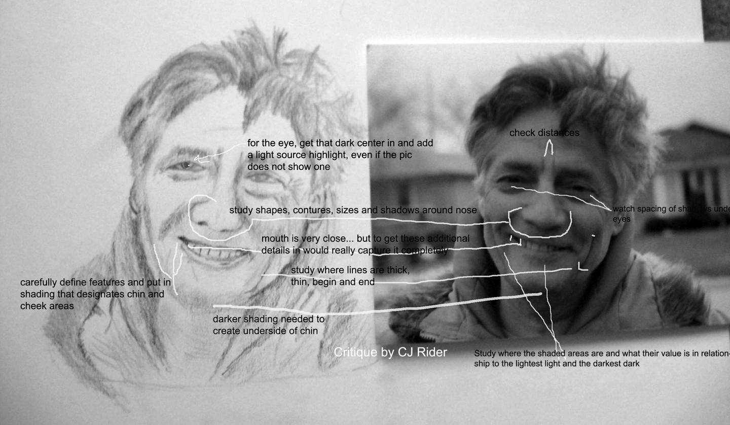
DISCUSSION PART 2:
Edits as made by Alice- great improvement!


CRITIQUE on edited image by CJ:
  1. Continue to check for spacing placement and sizing of features. Use the original tip above about measuring an eye or some other strong feature to use as a measure in photo then in drawing to insure size and placement is correct.
  2. Add more definition to chin with darker shading.
  3. Widen throat area- measure it with the eye in the drawing and then with the same eye in the photo- did you find the same or different amount of eyes fit across the throat?
  4. Add a dark center to the eye, then put in the light-source highlight. Your actual light source in this instance is not causing a highlight to the eyes that can be seen in this photo... In cases like this, I like to put one in anyway to add a sparkle to the eye. As you progress with your portraits you will learn to make the eyes look moist, etc. Make sure the light source is the same in each eye!
  5. note that center line of teeth usually is near the center of the bottom of the nose.
TIP: Line up the photo and the drawing evenly... lay a small ruler on the angle of the mouth, nose edges, (or whatever) in the photo, lay another small ruler on the drawing.. is the angle the same?

End critique-

Your hard work is really paying off! Congratulations! Great looking portrait!
cj

http://cdn.stumble-upon.com/images/32x32_su_shadow.gif

CRITIQUE 5 - De-clutter Photo


images below are copyright protected to Artist Karen Sliwinski and are not for use other than in this post as a learning tool.

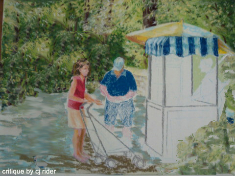
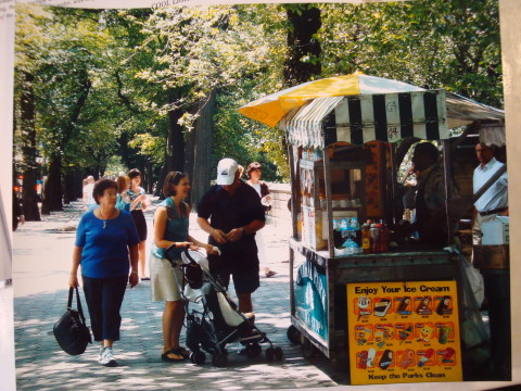
Karen stated that when turning her photo into a painting there were so many componants that it was difficult to discern the center of interest. She also asked about value variation.
  
ORIGINAL UNFINISHED PAINTING BY KAREN:
Looks GREAT! Love the way you are painting the figures as well as the foliage!


CRITIQUE:
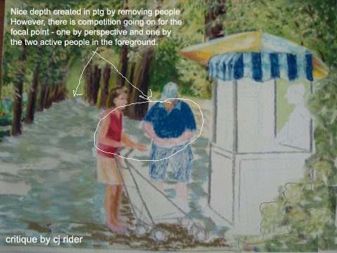
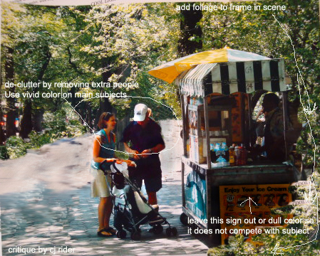
First task is to clear away some of the distractions and see what remains.


ABOVE: Removed extras and added foliage vingette on lower right edge - but note how the tree trunks come to an end right between the man and woman. Even though they are small, the woman's face is important. it is very detracting to have her facial profile lining up with the tree edge. Also, the base of the tree creates a line of sight across her neck, visually decapitating her.

Do not place strong value changes (or light against dark) in areas that are not your main focal point. The viewers eye will be distracted by high contrasting values, colors details and so on.

BELOW: remove distant point, and tree trunk between people - some subtle left edge tree trunks could probably be left in - I would also soften that tree behind the umbrella.

 If what you liked about the original photo was the tree-lined path, then all would have to again be reconsidered. ;)


Critique of Karen's original photo:

ORIGINAL PHOTO:

The photo is very busy with objects and contains many paths leading the eye in several directions through their value or vibrant color.
EXAMPLES:
  1. One point perspective tree'd path (in high contrast) leading to far back area of image
  2. Another light path between paying man and booth leading to rear area of image.
  3. Many subjects and many vivid colors all demanding equal attention.
Photo CRITIQUE:


Karen, Thank you for allowing me to critique your photo and artwork in progress! Your painting skills are fab!
cj

http://cdn.stumble-upon.com/images/32x32_su_shadow.gif

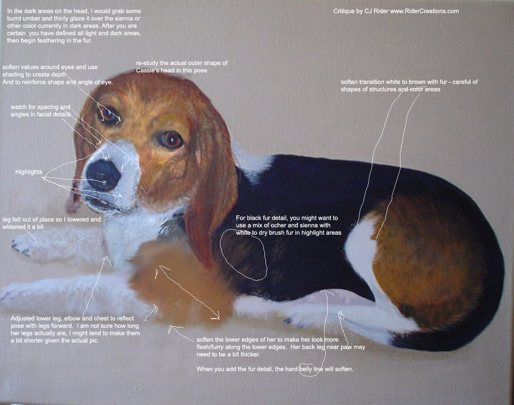
CRITIQUE 4 - Cassie Dog


images below are copyright protected to Artist Jan Stickland and are not for use other than in this post as a learning tool.

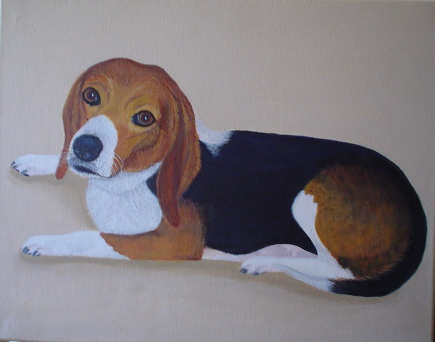
Besides a general critique, Jan inquired about what texture and colors can be added to the black fur. The colors used in the light fur are yellow ochre, burnt sienna and white.  
ORIGINAL PAINTING by Jan Stickland:
Actually, a very lovely painting as is!  Such a cute pooch!  This is Cassie!

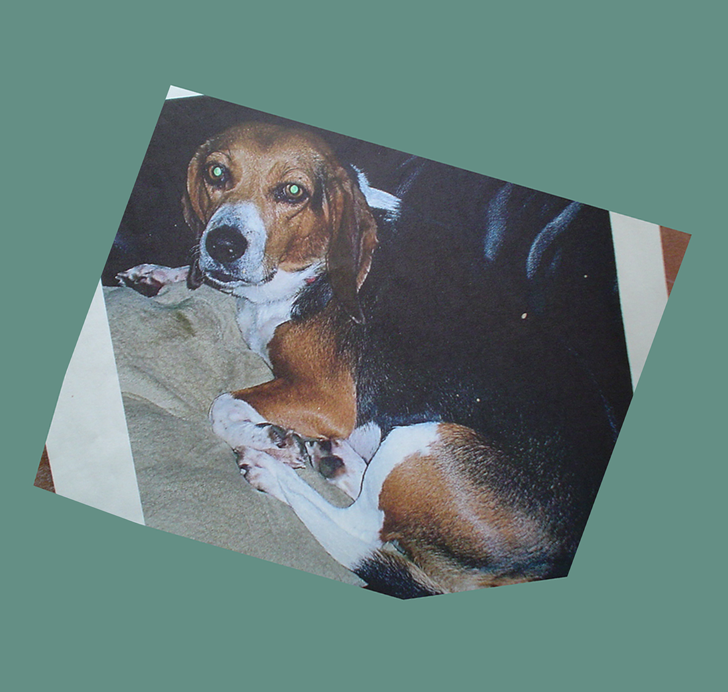
ORIGINAL PHOTO


CRITIQUE:
Details - In any painting, the first thing I consider is the placement of components in relationship to the overall object and in relationship to each other.  Keep re-checking as you paint to make sure shapes and angles remain as you intend.  


A dogs face can be very difficult due to foreshortening of the muzzle, shading, unfamiliar angles, etc..

Another issue is to make the dog look aged. hard sharp lines make the face appear younger, soft sagging lines give the appearance of age. Also a few gray hairs around the muzzle.
 

I often say "if you get the eyes right, much else will be forgiven" So if the eyes are on target, the viewer will not care if you miss a speckle or spot here and there! lol Jan did a marvelous job on the eyes - so alive and right to Cassie's character!
 

After the eyes, I would pay close attention to the shape of the black part of the nose, the muzzle and the shape of the white spot draping across the muzzle. The dogs lips also offer much insight and are an added bonus to further understanding Cassie's character.
 

I determined that the upper paw in the original painting detracted from the facial portrait so I moved down a bit, to be less of a focal issue. The lower edge of the dog's legs and body would appear more natural if softened and with more shading. Added detailing and shading on the cushion would add to the illusion she is set down into the surface.
 

For fur, I would first lay in the light and dark areas with whatever color you are using or burnt umber with a dark blue, maybe a squeak of black. As long as you establish the lights and darks that create the curves of the body. You can glaze these over the existing dark color so they blend nicely into each other along the edges and do not make spots. It may take several glazing layers to reach desired results. Then, you can dry brush in fur on top in a slightly darker or lighter value. I might experiment with some mauves and blues in the white and also the ochre and dark areas - just to break up the very yellow, ochre and dark dark darks... lol
 

A black or white object has much reflected color in it - so for instance, in the white chest, could have some blues, pinks violets etc all the while, the overall look is "white"

Thank you so much for allowing me to critique your painting -
Best Regards, CJ Rider

http://cdn.stumble-upon.com/images/32x32_su_shadow.gif

Friday, September 2, 2011

Interview by: Sea of Treasures

Photographer and Painter CJ Rider
Interview by: Sea of Treasures

Sell Art Online

Interview

Q: While this is a photograph, I love your paintings as well, which method do you prefer photography or painting?
My artwork is so intertwined that I find it difficult to choose one over the other. The thing is, if I am not painting in the field or from life, I use my photos to paint from. I do love to paint and it has a high level of satisfaction, however there is also nothing like looking at a disk of photos for the first time after an outing! When you comb through them and find that one little gem of a shot (well, hopefully it’s more than one) that you know has a special “wow” factor; – well, I think we all know how great that feels! Then there is Photoshop, which is a great vortex of time consuming fun too! One medium leads to the other for me which is why I enjoy them them fairly equally. Through my work I find I bounce back and forth between the mediums and when I am drawn to a subject I become very focused on the one particular medium or blend of mediums that best suits it.
For instance, so far, I have painted this photograph of pistachio trees in Oils and in pastels and have a variety of photo renderings as well as works from the digital tablet. Given the glowing aspects of the encaustic medium, I might give it a shot in encaustics too! Love to paint, but there is also nothing like “getting the shot” as well!
Q: Have you ever considered combining the two methods to create exceptionally unique pieces of work?
Yes I actually have combined the two to create new works in a variety of ways. I have used a hand-transfer method to incorporate parts of my photos into my artwork. I have blown up portions of my photo, cut out elements and incorporated them into a piece in a collage type manner. Loads of fun things to do when you combine mediums. I have actually started a painting from my photo, added transfers, then scaned all of that back into the computer and used photoshop to create a few other neat effects. I then print out the work on art paper and add more hand detailing if needed. The results can be very intense with many layers. Lots of fun to do too!

Q: What is your favorite subject matter and why?
I do lean toward people portraits for the most part. There is nothing more satisfying than creating a portrait that captures the essence of the person, even more than the likeness. When a client views their completed painting or photo for the first time and their eyes mist with emotion because the piece has captured that special quality in the subject. That is the best for me. That said, I will frequently sidestep to create a string of florals, still-life, landscapes, animals, or low horizon cloud and sky pictures. I think I take these side trips to refresh my minds eye.

Q: Over the past 5 years what has been the most important artistic lesson you have learned?
I have put together these thoughts from experiences throughout my life in the artworld and they have also held fairly true in the past 5 years: Sometimes you can build creative blockades for yourself because of pre-conceived notions about life, art and the people in it. Besides basic function, common sense and safety; Art and photography rules are meant to be used as jumping-off points to your own path, they are not necessarily the path itself. No one person has the “one true method or way”. An artist takes the information and creates their own vision and path, shut out the noise and chatter, and allow the mind to accept and react to its own creative voice from within! So I guess to sum it all up into one lesson maybe I would say: ”be true to your inner creative being” An often over used saying, yet it’s “easier said than done”.

Q: What made it so valuable?
Being true to myself, not blindly buying into popular or pre-conceived notions or popular stereotypes has freed my own creative eye. I am not afraid to create something that is not the “norm”. I have had many art labels ascribed to me over the years as I splash and dabble along to my own tune, I have had to use these same art labels to describe my website, workshops or other public postings. I just don’t let them box me in or stifle my curiosity, experimentation and eclectic nature.

Q: Looking ahead over the next 5 years what do you aspire to achieve artistically?
I would like to see my Budding Artist program grow. (BuddingArtist.Info) It is an art workshop each week for “at risk” children. I would personally like to put some of my artistic ideas and “how to’s” in book form to give others the info that I wish I would have had when starting out. Much can be demystified for aspiring artists and photographers.

Q: What artistic method(s) are you looking to master in the future?
I would like to further perfect my skill in Encaustic painting, it is a fascinating medium. The technique is centuries old but continues to quietly draw people into its rich beeswax and vibrant colors. Once you play in the wax you are hooked (it is very sticky)! ;) I have dabbled in it for many years but am currently jumping back into it with both feet. Actually, a fairly new venture for me is working with YUPO paper, a plastic-like paper. I keep on working it and hope to stay in the saddle until I can make the paper respond more favorably to my brush!

Q: Is there an artist out there who’s work inspires you?
Lately I have run across so many inspirational artists on Fine Art America and other internet artist havens. It has really broadened who inspires me to a level where it is difficult to list them all off If you would have asked me this question before the internet – I would have had a couple of very clear answers for you- because back-in-the-day “we” were all exposed to basically the same handful of artisans. But now, there are so many to look up to and be inspired by.

Q: Is there a project or piece of work that you will be sharing with your fans in the near future?
Yes, I am working on a series of encaustic works that I will be sharing in the near future. The pieces will be from realistic and detailed to abstract and instinctual. If what I have so far is any indication, it should prove interesting.

Q: What can you say about it to wet our appetites?
You will see rich colors, textures and translucency that only hot beeswax can produce! You may even see bits of my photography involved!

http://cdn.stumble-upon.com/images/32x32_su_shadow.gif

Wednesday, May 19, 2010

My Artwork as a TV set prop?


I have just joined the ABC Studios Licensing Program giving ABC and Disney permission to use my artworks when designing sets for popular TV shows.

Who knows, my artwork could be used as set decorations or props in upcoming TV episodes!

http://cdn.stumble-upon.com/images/32x32_su_shadow.gif