Showing posts with label drawing. Show all posts

Saturday, February 23, 2013

CRITIQUE 15 -PROPORTIONS: EYES

There are many good things about your sketch! You have a created a good likeness to the original image and I will show you how to make a few tweaks to get it even closer.
I will break down your portrait sketch review into several parts so we can be more thorough. 
Below is part one.

I want to focus on placement of eyes in relation to each other and the space for the nose. I would recommend sketching just the eyes and bridge of nose (utilizing the tips) a few times until you begin to see more and more details. The more you draw something - the more you see its details.
You have the lower edge of the eyes in proper alignment with each other in your sketch, but if it ever becomes an issue, you can see how a line under the eyes on the original would help you clearly visualize how the eyes are placed on the face.


http://cdn.stumble-upon.com/images/32x32_su_shadow.gif

Sunday, February 3, 2013

CRITIQUE 8 -Portrait of Father


Alice, Very nice likeness and sketching!   I will offer tips and ideas to aid in spacing of the features.   Hope it helps - and - Thank you for allowing me to offer pointers concerning your portrait!

cj

PS - forgive the measure markings in the hair!!  lol

CRITIQUE:


TIP: A good idea with any painting or sketch is when you think you are finished, turn both the painting and the resource photo upside down and then on its edge and see how it looks. By turning the image, you start seeing it more abstractly as shapes and values. Turned, you are more likely to spot if something is a bit off kilter, etc.

TIP: Measure an eye in the original photo - then use that measurement as a base for marking off distance and spacing for all facial features in the photo.

THEN - measure the same eye (either right or left) in your drawing and make the same spacing measurements on the drawing.  For instance maybe the nose is a certain number of "eye's" long, and so on.  This will make sure you have features properly sized and spaced. IF your drawing is the same size as the image in your photo, then you can apply the photo measurements to the drawing too.

TIP: when you feel your portrait is complete, set it aside for a few days, covered. THEN without looking at it, (don't peek!) set it up in an area that you might come around a corner and see it- and walk away without looking! .... I know it sounds crazy, but trust me... When you are surprised later by walking into the view of the piece, it will be like seeing it for the first time. If anything is "off" you will see it in that first glimpse and as you walk closer to the piece. Artists will do these things to get a fresh view or perspective on their own artwork.

TIP: View image in a mirror for a fresh perspective

TIP: take a photo and look at it on the computer screen or print it for a fresh view.

WORD OF WARNING about  working from PHOTOS - "Photos lie!" Well.. ok, they don't always portray the actual truth of a subject. One instance is where a photo might show a black area with no details might actually be not so black and full of details in person! So be aware that especially on a face - we do not have any detail-less black areas.

VALUE TIP: find the area on your portrait that is the darkest value and place it onto your drawing

Thank you for allowing me to critique your portrait - I hope these tips are helpful.

cj

http://cdn.stumble-upon.com/images/32x32_su_shadow.gif

CRITIQUE 6 - PORTRAIT Tips


images below are copyright protected to Artist and are not for use other than in this post as a learning tool.

Alice, Very nice likeness and sketching! You have created a very nice portrait with feeling! Just a few small tweaks might add to it's persona. I will offer general tips and ideas and also give some ideas that are specific to this drawing, Hope it helps - and - Thank you for allowing me to critique your portrait! cj
CRITIQUE:
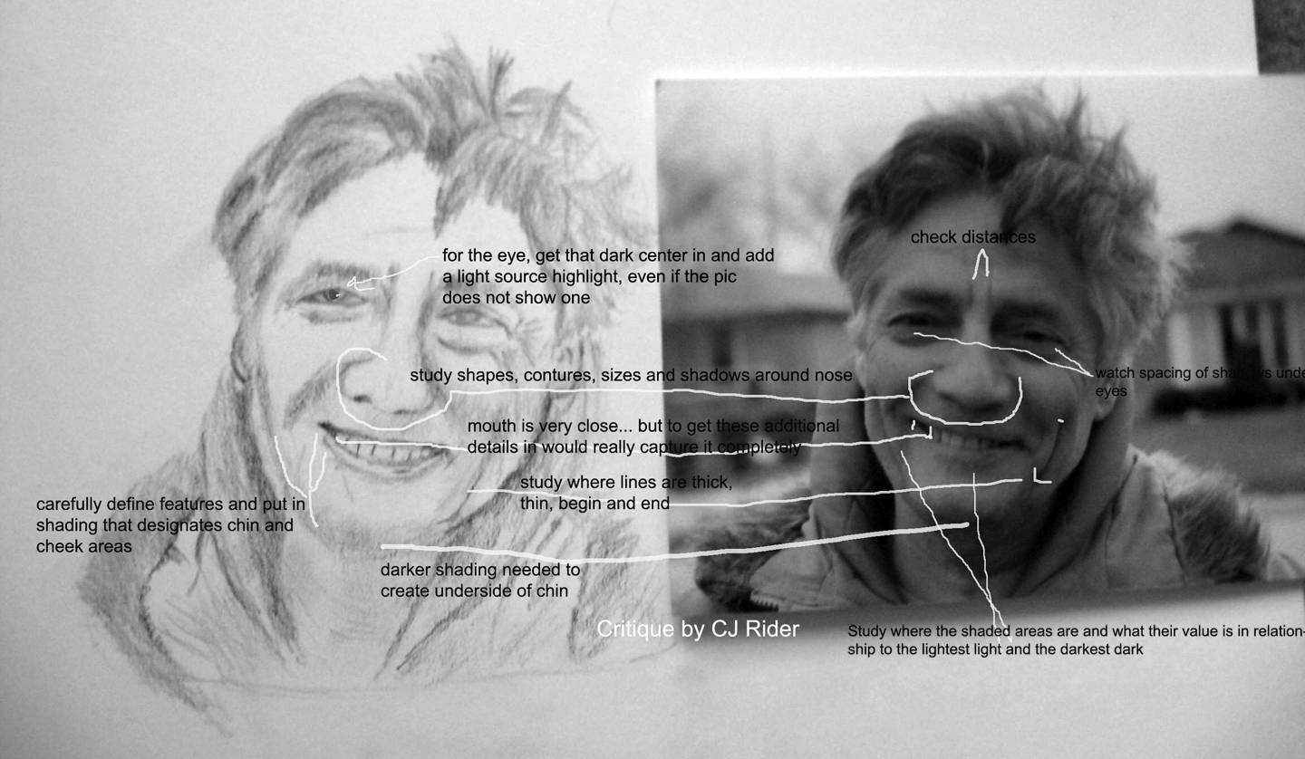
I began by changing the color photo to grayscale in photoshop. This way, it is easier to see what is color and what is actual value change.

TIP:  A good idea with any painting or sketch is when you think you are finished, turn both the painting and the resource photo upside down and then on its edge and see how it looks. By turning the image, you stop seeing it as a person you know, a mouth, a nose and start seeing it more abstractly as shapes and values. Turned, you are more likely to spot if something is a bit off kilter, etc.
You have the eyes quite well and they are captivating for the viewer - and quite recognizable as the person you are drawing - so you already have your viewer at the eyes! Some hair out of place, etc is not important. However other major facial features are the next concern after the eyes.
TIP: Measure an eye in the original photo - then use it as a base for marking off distance and spacing for all other facial features in that particular face IN THE PHOTO. THEN - measure the same eye in your drawing and make the same spacing measurements on the drawing. This will make sure you have features properly sized and spaced. IF your drawing is the same size as the image in your photo, then you can apply the photo measurements to the drawing too.
TIP: when you feel your portrait is complete, set it aside for a few days, covered. THEN without looking at it, (don't peek!) set it up in an area that you might come around a corner and see it- and walk away without looking! .... I know it sounds crazy, but trust me...   When you are surprised later by walking into the view of the piece, it will be like seeing it for the first time.

If anything is "off" you will see it in that first glimpse and as you walk closer to the piece. Artists will do these things to get a fresh view or perspective on their own artwork. Even viewing it in a mirror or taking a photo and printing it out are good tools for a fresh view.
WORD OF WARNING about PHOTOS - "Photos lie!" Well.. ok, they don't always portray the actual truth of a subject. Where a photo might show a black area with no details might actually be not so black and full of details in person! So be aware that especially on a face - we do not have any detail-less black areas. - this comment is for artists trying to create a realistic looking portrait, not an abstraction, etc.
VALUE TIP: find the area on your portrait that is the darkest value and place it onto your drawing
Thank you for allowing me to critique your portrait - I hope these tips are helpful.
cj
.

DISCUSSION PART 2:
Edits as made by Alice- great improvement!


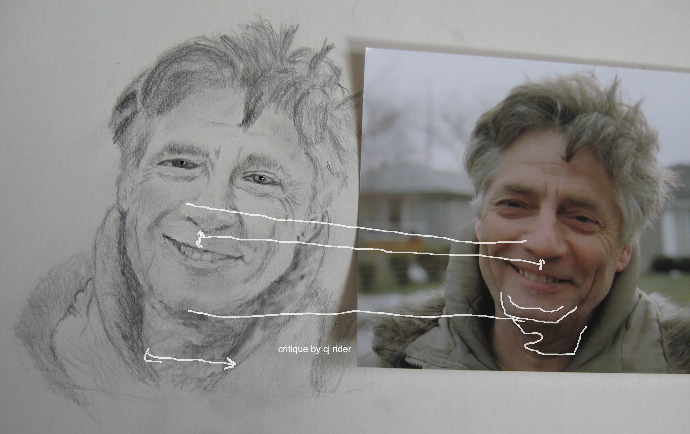
CRITIQUE on edited image by CJ:
  1. Continue to check for spacing placement and sizing of features. Use the original tip above about measuring an eye or some other strong feature to use as a measure in photo then in drawing to insure size and placement is correct.
  2. Add more definition to chin with darker shading.
  3. Widen throat area- measure it with the eye in the drawing and then with the same eye in the photo- did you find the same or different amount of eyes fit across the throat?
  4. Add a dark center to the eye, then put in the light-source highlight. Your actual light source in this instance is not causing a highlight to the eyes that can be seen in this photo... In cases like this, I like to put one in anyway to add a sparkle to the eye. As you progress with your portraits you will learn to make the eyes look moist, etc. Make sure the light source is the same in each eye!
  5. note that center line of teeth usually is near the center of the bottom of the nose.
TIP: Line up the photo and the drawing evenly... lay a small ruler on the angle of the mouth, nose edges, (or whatever) in the photo, lay another small ruler on the drawing.. is the angle the same?

End critique-

Your hard work is really paying off! Congratulations! Great looking portrait!
cj

http://cdn.stumble-upon.com/images/32x32_su_shadow.gif

Sunday, September 13, 2009

Tip on acheiving VALUE balance in your art

grayscale posturized image vs full color image

Many paintings fail due to poor value balance.

If a painting is nearly all one value, it will lack life even if it is correct compositionally.

A way to see value is to:
  1. Open image in photoshop
  2. At the top of the screen select: Image/mode/grayscale
  3. At the top of the screen select: Image/adjustments/posturize
  4. set for around "5"
  5. with experimentation of the numbers in step #3 and 4 you can see that the higher the setting the more detail shows up.
  6. the idea is to not have the detail and only see larger shapes of value (light and dark).

As a pre-painting step - run your image through this process and then reference the resulting print-out to make sure you preserve proper values as you paint.

You can also take a photo of a completed painting and run it through this process to see if you have the needed value balance within the piece.

If you posturize a color image it can assist you in discovering subtle colors or give you coloration ideas to add to your painting!

http://cdn.stumble-upon.com/images/32x32_su_shadow.gif